OLOVIZ: Visualizing all food orders placed online 
What I learned from my 9 months of online food order data
Since, moving to Singapore last July I have extensively placed online orders (OLO) for food ![]() using foodpanda
using foodpanda ![]() , Domino’s
, Domino’s ![]() , UberEats
, UberEats ![]() or Deliveroo
or Deliveroo ![]() to get food delivered at home.
to get food delivered at home.
Soon enough it struck me that I have accumulated quite an amount of data that I can analyze to see my ordering patterns and behaviors to answer simple questions like how frequently do I order, how much money do I spend, which cuisine I tend to order more, and which restaurant cost me more and how the ordering pattern has varied over time? Essentially to figure out where does my ![]()
For answering all these questions I needed some python and a lot of Tableau. And the results were intriguing.
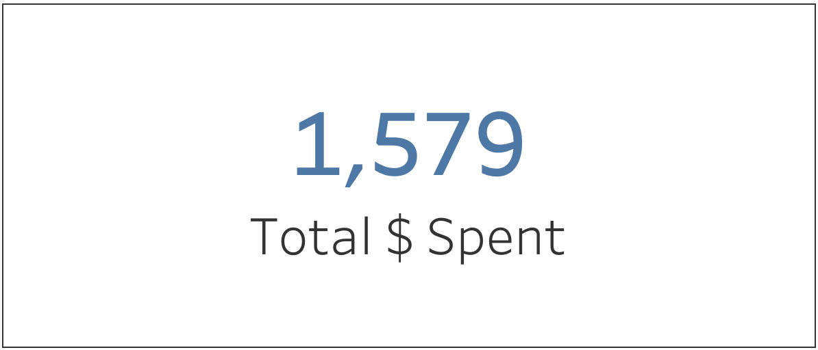
In total, I have spent close to S$1579 on OLO, have tried 26 different restaurants and spent an average of S$30 per meal.
Favorite Cuisine - Indian 🍛
Most Expensive Cuisine - Mexican 🌮
Max # of orders - Friday 🥂
Pocket friendly service - Deliveroo
Getting the data
I scraped orders from foodpanda and Deliveroo websites using python’s requests and beautifulsoup library.
UberEats had only 5 orders and on top of that since Uber is not operational in Singapore anymore so it made sense to write those in manually rather than scraping them using python since there was no point spending time on writing code that I won’t be using in future anyway.
I tried scraping Domino’s orders but realized that they are using virtual DOM, so the problem boiled down to scraping JS rendered web page. I came across Selenium which can be used to do this, gave it a shot but realized that it would take more time and effort than I could afford to put in right now, so I skipped it and wrote the data in manually. (luckily I had placed only 7 orders so it was not that bad.)
Further, I wrote a script that merges OLO data from all these 4 services and gives a consolidated file that contains all orders placed over the past 9 months.
I extracted data for 4 relevant fields for each orders - Cost, Date, Items Ordered, Restaurant, Service
Cost reflects the bill amount
Date is the date of order
Items ordered is a list of items that I ordered in that particular order
Restaurant is the outlet from which I ordered
Service is the online service through which the order was placed
Here’s a snapshot of how the dataset looks -

The code for scraping the data and merging datasets can be found here.
I came across Tableau sometime ago and were completely taken by its brilliant UI and amazing charts so I decided to give it a shot. Here are some insights from the data.
Number of Orders Increased Over Time 📈
In the beginning, I didn’t order online much since I preferred cooking at home. So there was not a single order in July and August. Soon life became busier and I couldn’t find time (and/or the motivation 🙈) to cook at home, and thus began my food OLO journey.
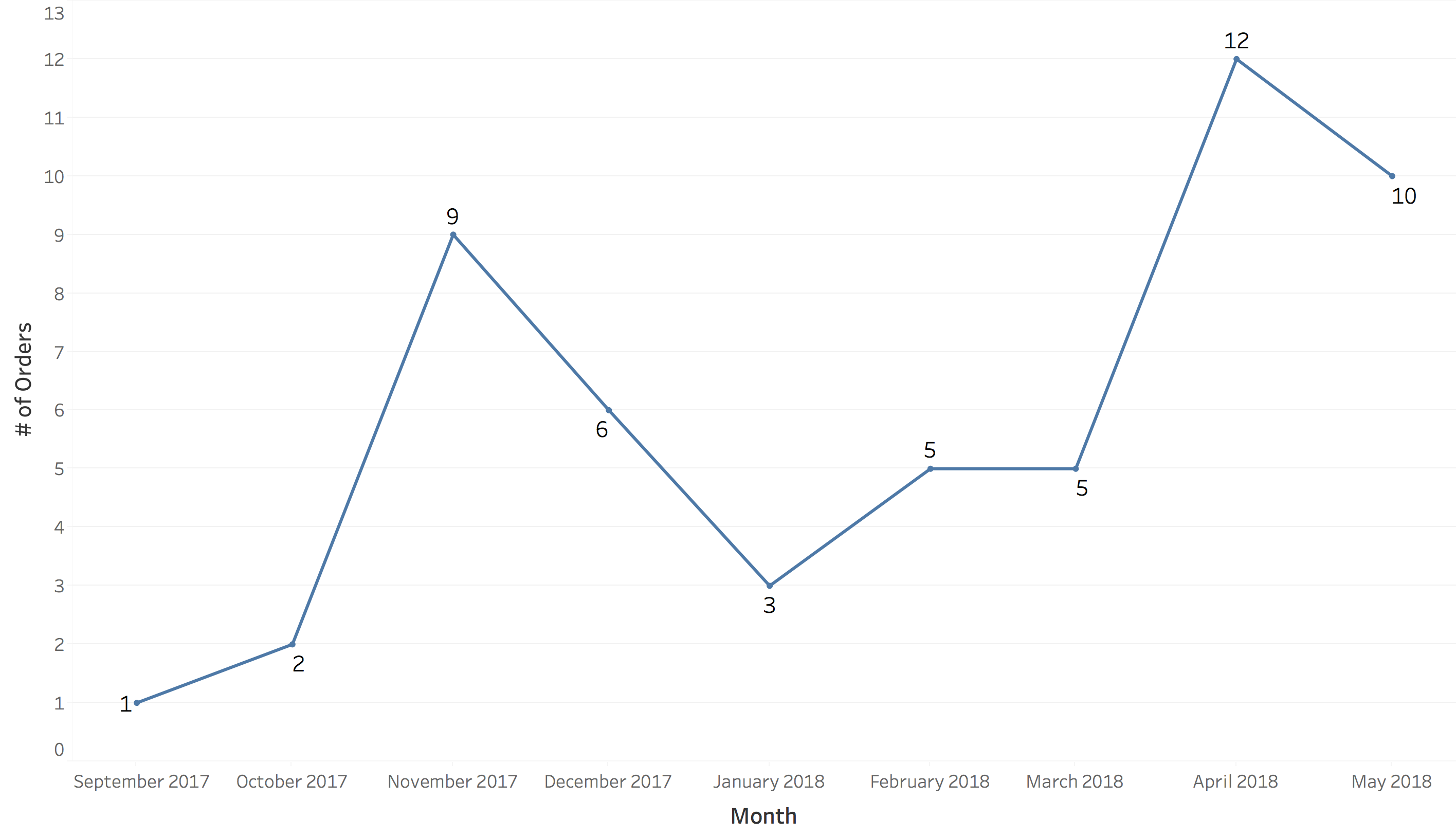
It cost me dearly in the beginning: see that spike in November - that’s when I gave up cooking at home entirely (cooked ![]() at the most). I soon realized that money doesn’t grow on 🌲 so I reined ourselves.
at the most). I soon realized that money doesn’t grow on 🌲 so I reined ourselves.
In January, # of orders decreased to an all time low because I was not in Singapore for long (semester break). April has the maximum orders as I was down with Chicken pox and was under house arrest for almost 2 weeks.
Service Usage over Time 
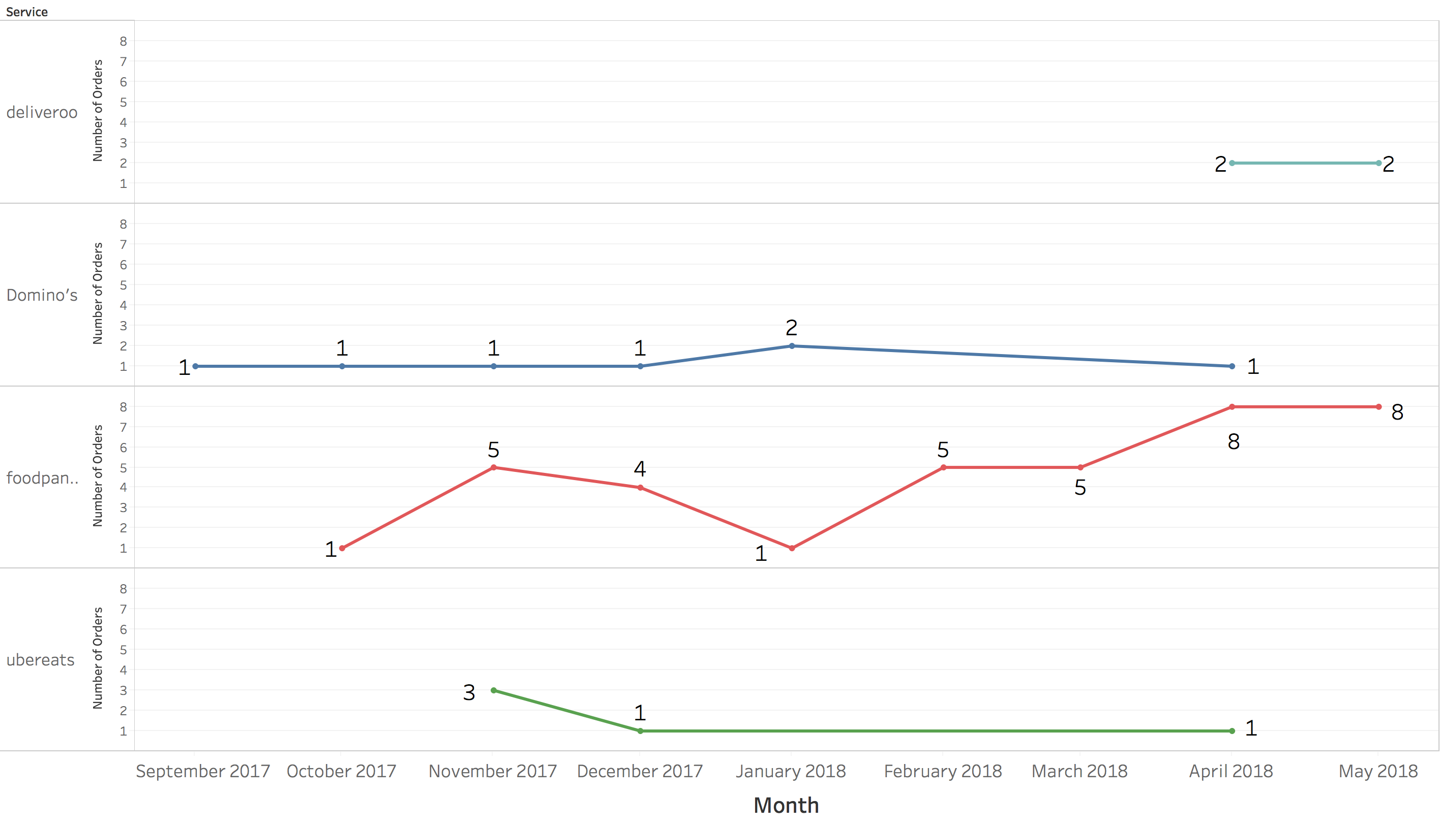
A quick view of the above graph shows that foodpanda is my preferred service. An interesting thing to note here is that I have consistently placed 1 Domino’s order every month. This is proof that promo codes actually work! Domino’s gave me a coupon for free pizza each time I ordered (due to late pizza delivery), it makes me wonder if they do it on purpose to tie me down in a vicious cycle of ordering every month.
I placed my first order with Deliveroo last month and expect the orders to rise since the ice has been broken.
Most Used Service - Foodpanda 
As mentioned foodpanda is my favorite service, this is particularly because they have a good UI, vast number of Indian restaurants listed and a variety of cuisines on offer. Also, I get frequent promotional offers as compared to other services (Deliveroo, please note!!).
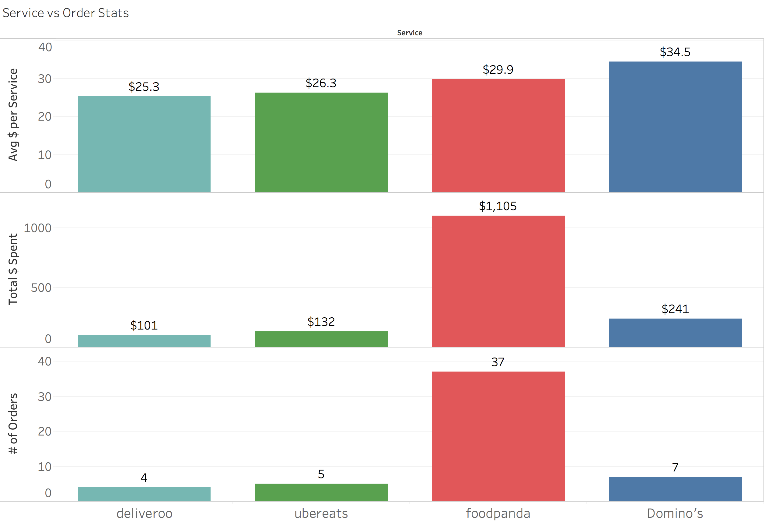
Economy service: Deliveroo
Although I haven’t ordered much with Deliveroo to support this conclusion, the average cost of meal per service is lowest. I feel that they have more Hawker Centres (which provide low cost food across Singapore) listed on their app than any other service provider. So, it seems like I should definitely order from Deliveroo more often and see if I end up saving some money.
Most Expensive Service: Domino’s
An order from domino’s costs me more when compared to any other service. They have sure done a great job in extracting money from me owing to the aforementioned vicious cycle.
Average Cost of Meal for Restaurants 
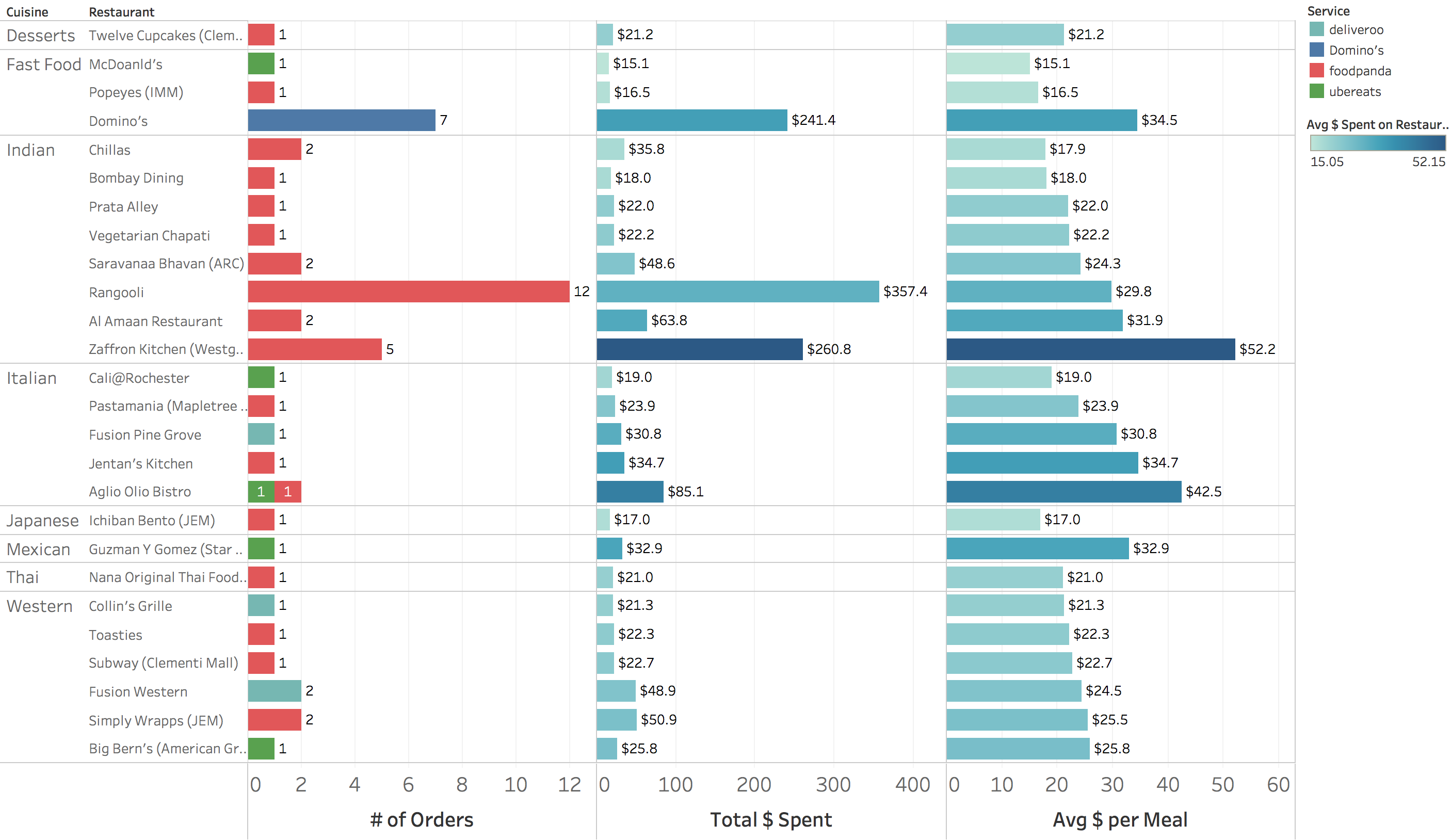
Further, I wanted to find out average cost of meal for each restaurant and cuisine.
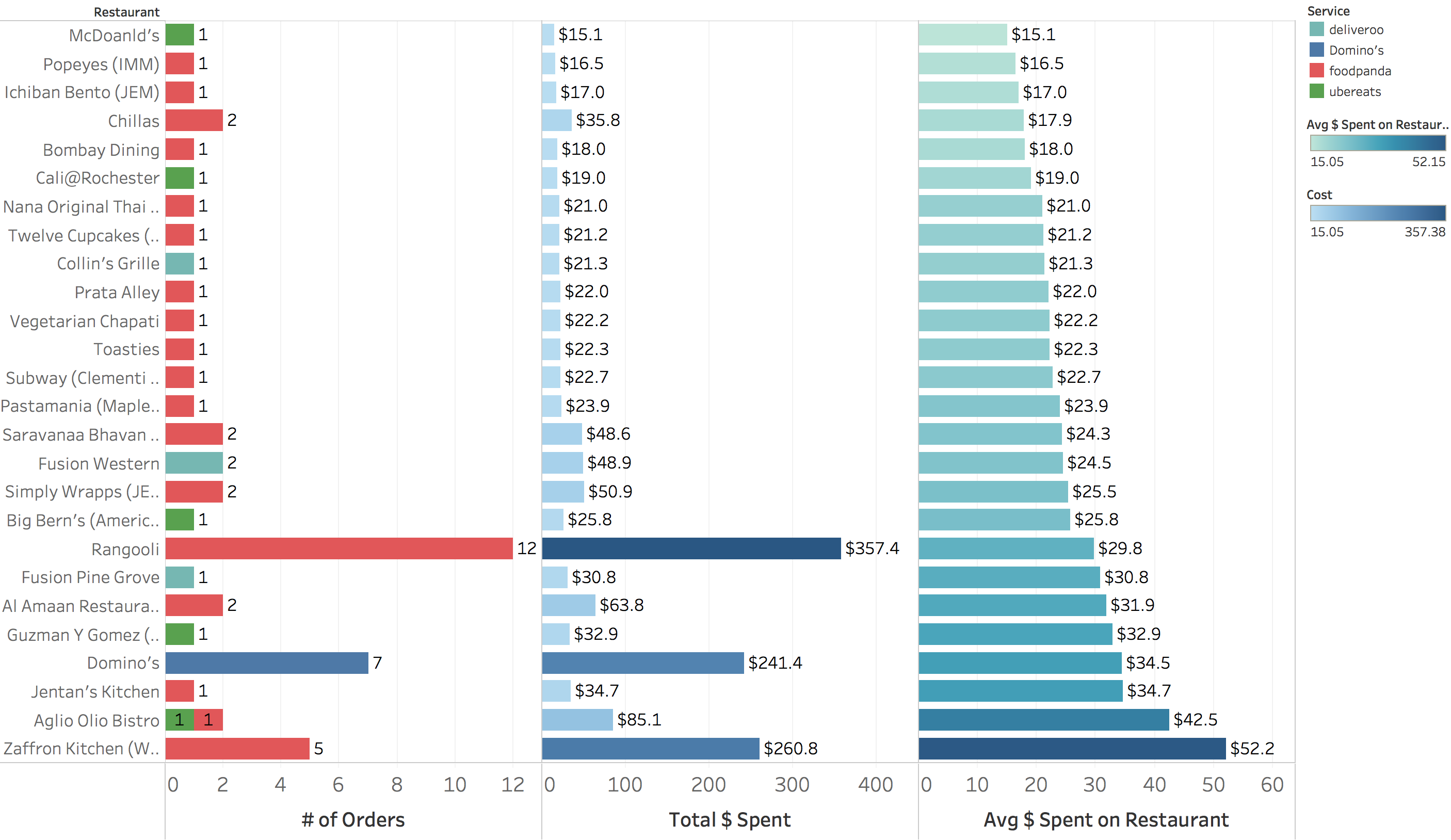
Zaffron Kitchen costs me the most and Rangooli is probably the best Indian restaurant (out of what I have tried via OLO) in terms of food quality, taste and cost.
For Fast Food Chains, Domino’s ![]() definitely costs me on the higher side. Cheapest of all is McDonald’s
definitely costs me on the higher side. Cheapest of all is McDonald’s ![]() which is expected.
which is expected.
I found that for Western Food, average cost per meal is consistent for all restaurants, while it varies significantly for Indian & Italian Cuisine. So I would probably go for Western when I want to try a new restaurant and remain within budget.
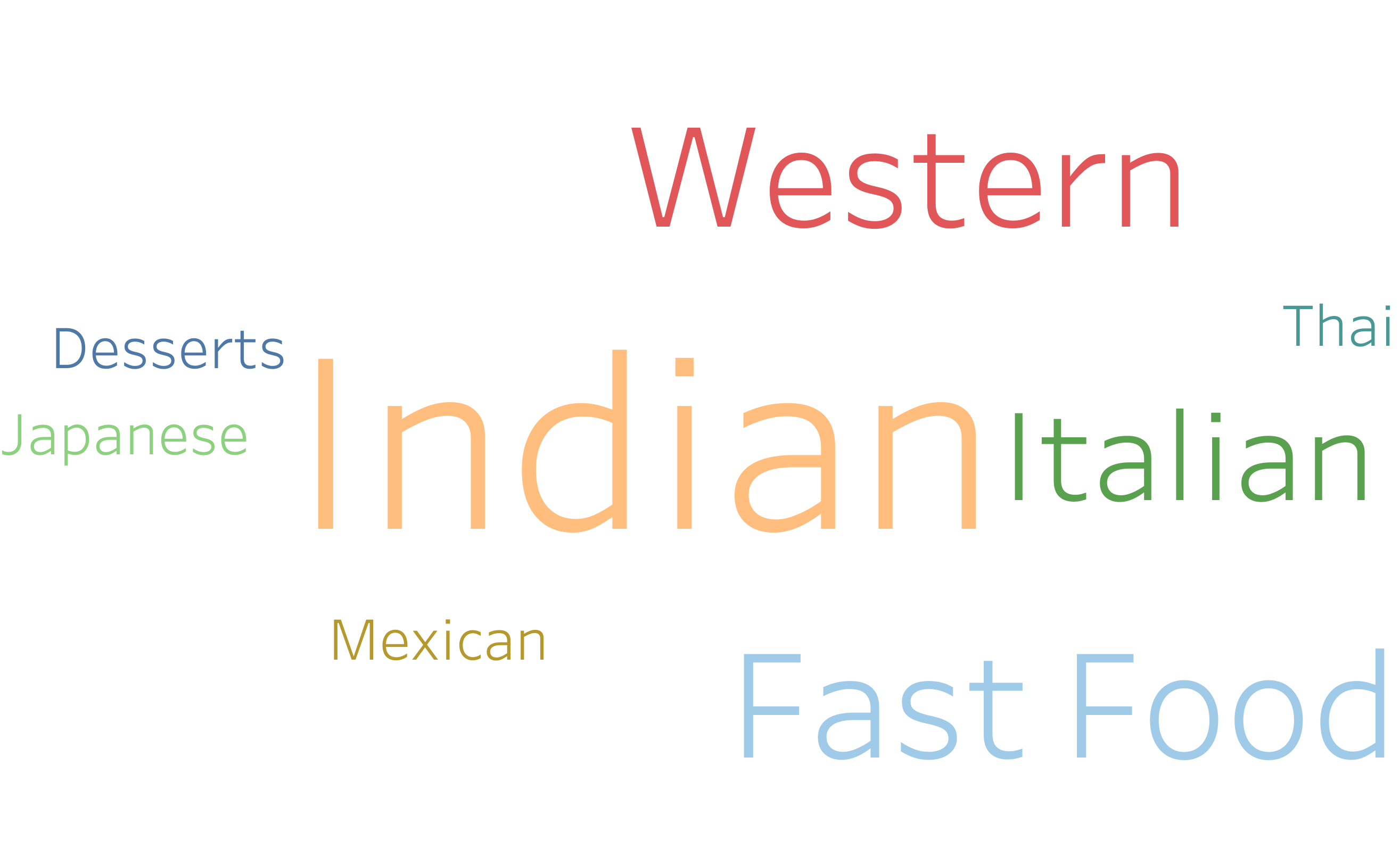
Most ordered cuisine 
No surprises here. The most ordered cuisine is Indian, with Fast food being the second highest (coders and PIZZA you know it 🤷) followed by Western.
Percentage of money spent on different cuisines 
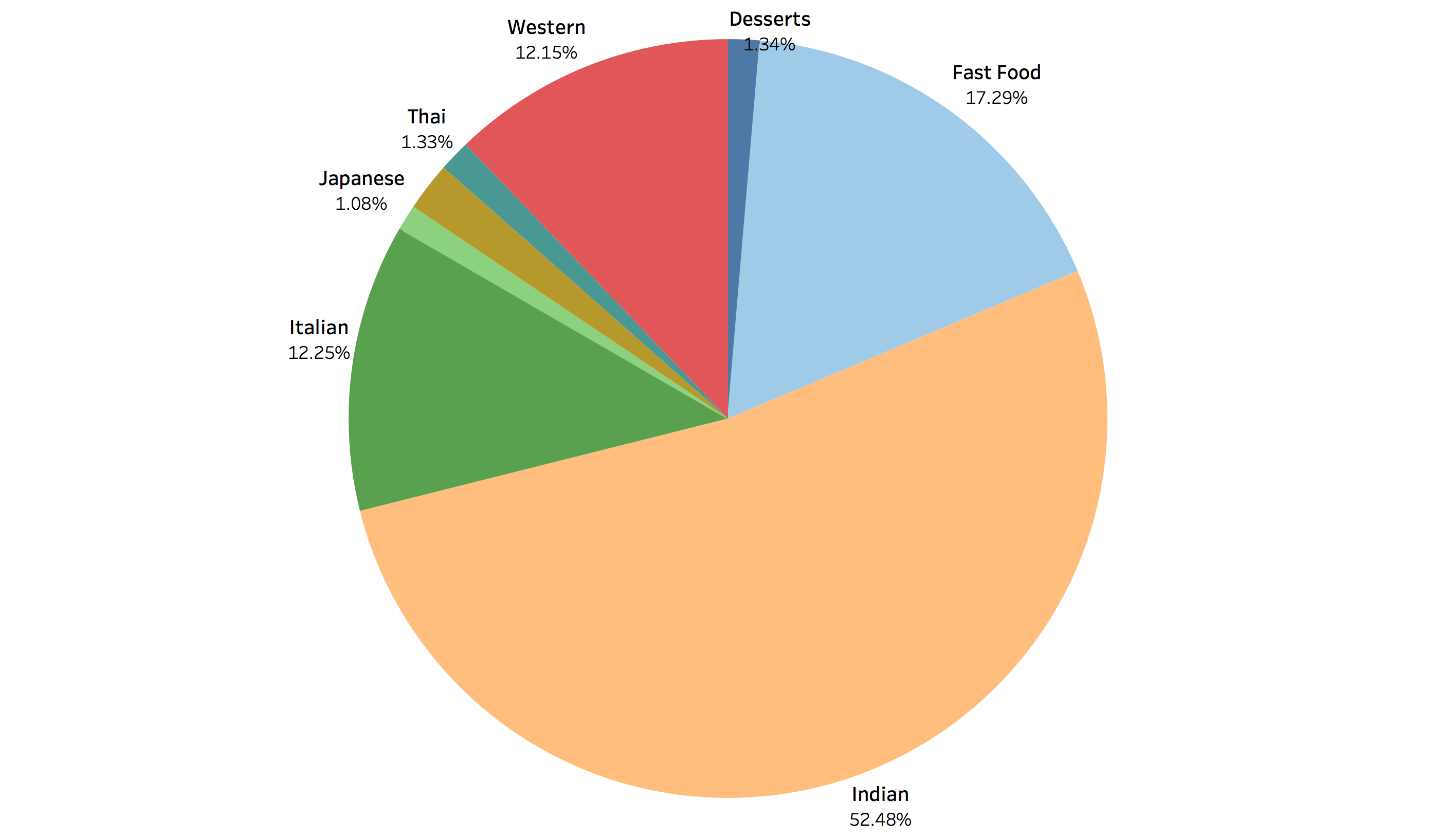
I should really start ordering cuisines other than Indian more often. (Maybe try more Japanese and Thai since they are cheaper too.)
Avg. cost per meal for each cuisine 
In the graph below, size of the square is proportional to average cost of cuisine, and darker color corresponds to higher number of orders.
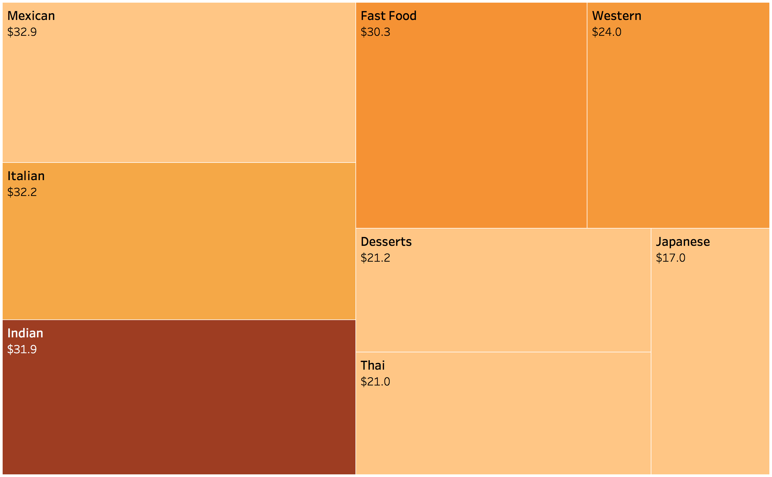
I found that Mexican is the costliest followed by Italian and Indian (not much to separate between the 3 though).
Western Food costs way less than the other cuisines so I should probably start eating Western more frequently in order to save some money.
Months vs Order Stats 
One of the challenges of ordering online is to order good food while saving money at the same time. When I started ordering online I didn’t know how to order efficiently. I had gaffes like expensive but unsatisfactory food, ordering too much or too little etc. However with time I have learnt the art of OLO as proven by the graph below: the average cost of orders has decreased over time.
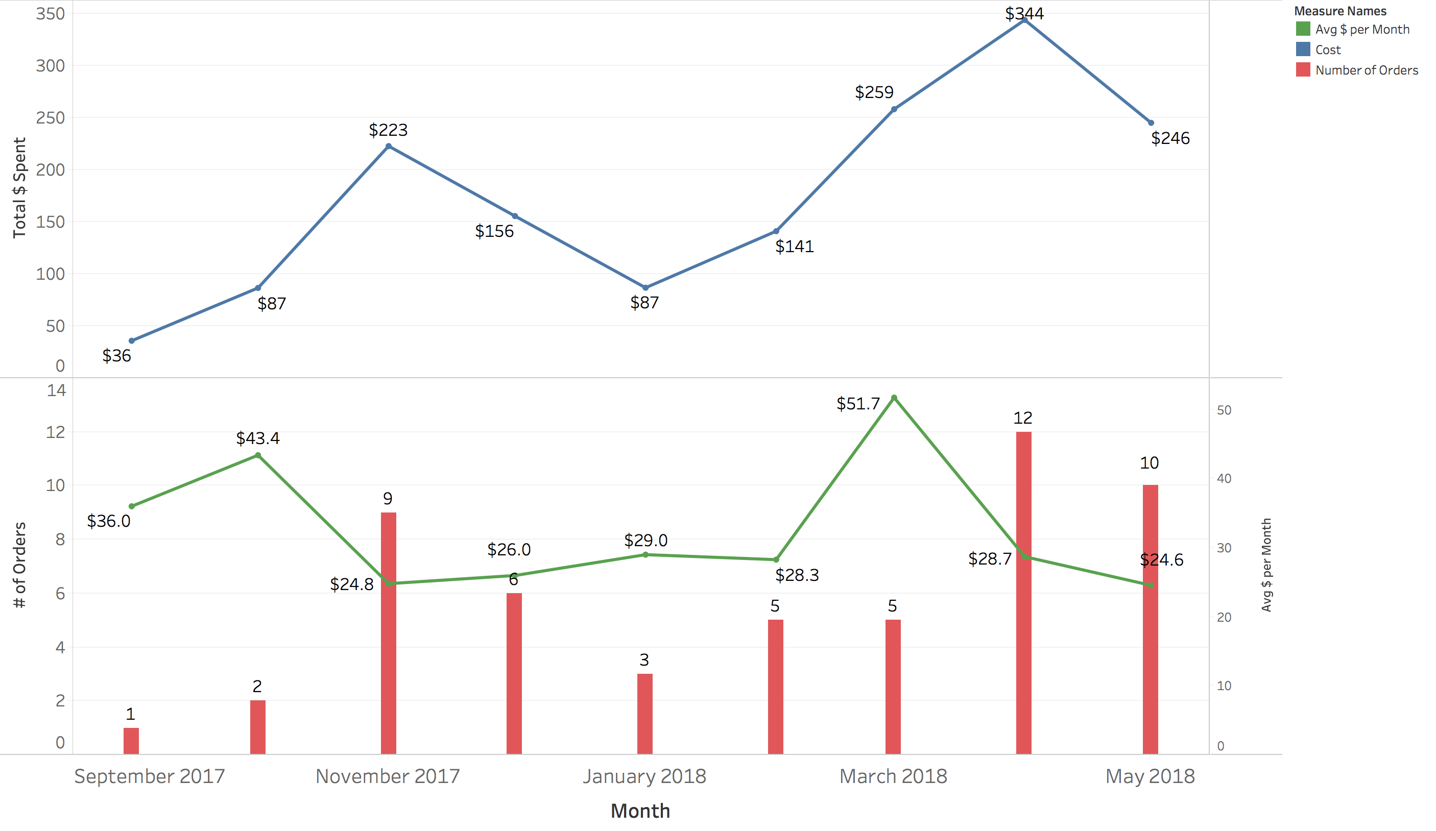
The spike in March can be attributed to the fact that I hosted a couple of parties at my place and had friends over, so the orders were large and pretty expensive.
Day of Week vs Order Stats 
This is my favorite viz. I wanted to know if day of week affects my ordering pattern. The visualization shows No of orders and Avg. Cost of Meals for each day of week. The darker shade of the color depicts that the average cost of meal is higher.
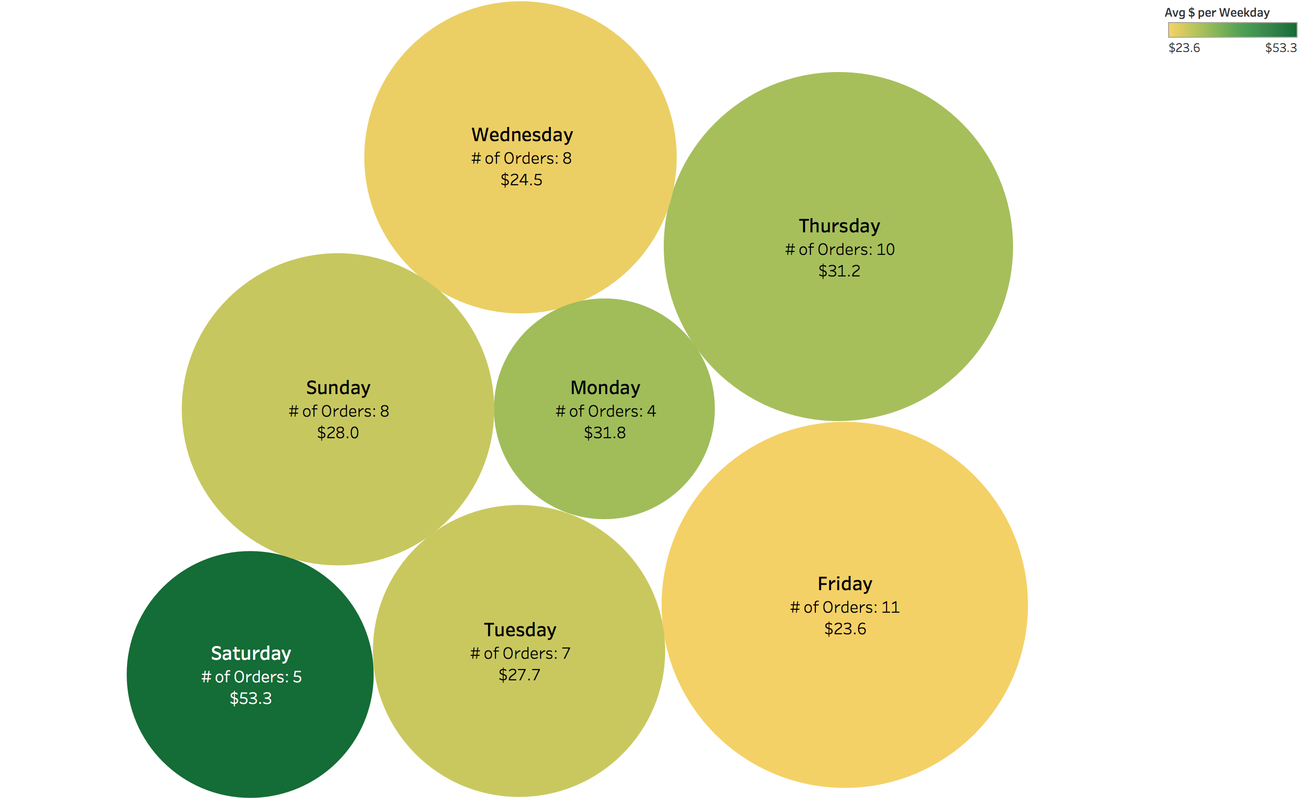
I found that I am more likely to order online near the weekend (Thursday, Friday and Sunday). This is because I have more lectures on Monday, Tuesday and Wednesday so I stayed in college and ate there. On the contrary, in the later part of the week I stay at home and tend to order more.
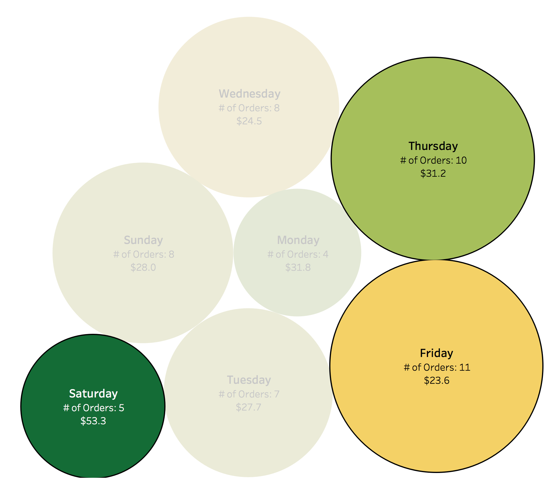
Another interesting insight is that on Saturdays the average cost of meal is higher though the number of orders are less. I realized that on Saturdays I either went out for dinner or had friends over for house parties.
Summary


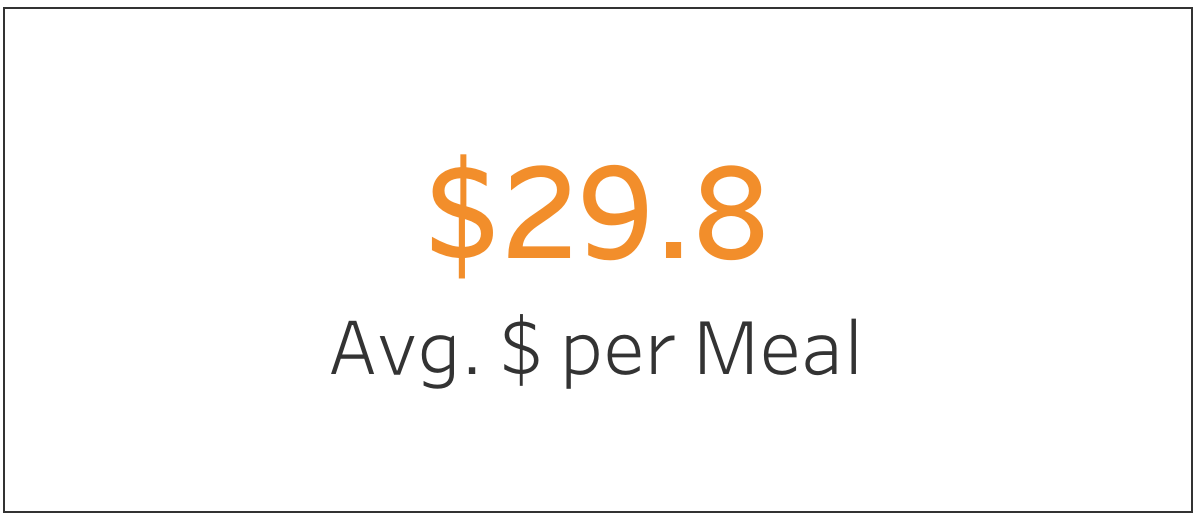
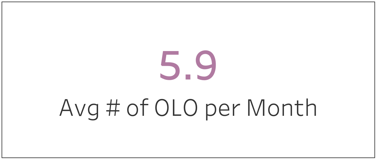
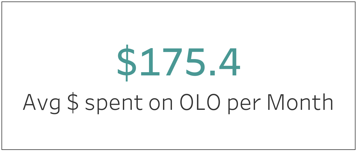
Being a die hard python programmer what amazed me the most was that I was able to draw all these visualizations without writing a single line of code, it seemed like it would take days to create such visualizations with matplotlib or plotly but with Tableau I was able to create interactive viz in minutes with just a few clicks.
You can take a look at the Tableau Workbook that contains all the above visualizations here.
What’s next
- Use selenium to scrape orders from Domino’s website, because Domino’s orders are going to increase over time (that is inevitable.)
- Use my Splitwise logs to get data for restaurants I dine in, for a consolidated overview of expenditure on food.
- Improve ordering habits and redo the analysis every 6/9 months to see if there is any improvement in ordering pattern (lower average cost, trying more restaurants, saving more).
- Analyze meals data, to understand most preferred dish, use a food database API to gather nutrition value of each meal.
- Lose some weight. Yeah man, after gorging on all these meals over the past 9 months I have become fatter than ever, need to hit the gym, it’s HIGH TIME.
About Me
- I live in Singapore 🇸🇬 with my girlfriend (both CS Majors at NUS) and placed the orders for both of us. ( So all orders were for 2 people)
- Both ~24 year old with no food allergy whatsoever (🤞)
Disclaimer
In this post, I don’t intend to promote any food delivery service, cuisine or restaurant. Ordering food is a subjective activity and depends on several factors like - number of people eating, appetite, fondness for a cuisine, locality, restaurants listed on OLO service, your preferred service, gender, race, ethnicity, age, food allergies etc.
I did this for fun and do not intend to define average cost of any restaurant or food delivery service. Please do keep in mind that you may get numbers which maybe entirely different from mine.
Note: There exists only 1 order for some cuisines/restaurants so that is definitely not a good representation, but I wanted to try this analysis with whatever data I had. These numbers may change entirely 6 months down the lane.